Top Ten Tuesday was created by The Broke and the Bookish in June of 2010 and was moved to That Artsy Reader Girl in January of 2018. It was born of a love of lists, a love of books, and a desire to bring bookish friends together.
Previous Top Ten Tuesday Topics
- 2nd August: Books Set In A Place I’d Love to Visit
- 9th August: Hilarious Book Titles
- 16th August: Books I Love That Were Written Over Ten Years Ago
- 23rd August: Completed Series I Wish Had More Books
- 30th August: School Freebie
- 6th September: Books I Loved So Much I Had to Get a Copy for My Personal Library
- 13th September: Books with Geographical Terms in the Title
- 20th September Bonus: Favourite Literary Queens
- 20th September: Books on my Fall TBR
Last week I lamented that I was in a reading slump and it seems that I am still there: I have begun The Trees by Percival Everett as a book and The Last House on Needless Street by Catriona Ward. I had hoped that Needless Street might jolt me out be being a shift of genre… but it is not gripping me. The language feels a little too obvious and self conscious maybe, and the narrative voice of the cat is just not working for me… In contrast, The Trees feels much fresher, with the advantage of tiny short chapters and it always feel good to whizz through five chapters in a twenty minute break at work!
So, things are starting to look up in time for my birthday on Friday, even if my feelings on reaching 49 are a little mixed!
Anyway, this week’s topic focusses on covers. I am always a little insecure about cover lists: the vast majority of my reading is done on my Kindle and I use Calibre to manage my books, which draws in covers from who-knows-where on the net! I have no idea whether the covers I have are the official UK ones! But, we can always use Amazon to double check! And the focus for these covers is typography which the internet describes as
the art or work of preparing books, etc. for printing, especially of designing how text will appear when it is printed
or, visually, I did like these images


In more layman’s terms, as I scroll through my book covers, I am looking for covers where text is the main feature rather than imagery, and which is itself interesting or gorgeous!
Many thanks to Mareli @ Elza Reads for suggesting this theme. I do also apologise for Mareli for any offence caused to Elza her cat and feline inspiration for her blog for any offence caused by my comment about the cat as a narrator in The Last House on Needless Street!


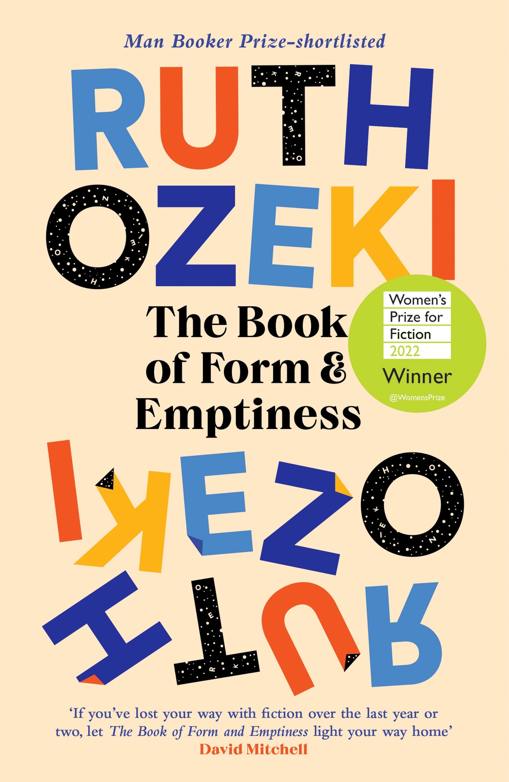
Ruth Ozeki, The Book of Form and Emptiness

For a novel which is all about the eponymous book, and which is narrated by The Book, and in which The Book narrates and / or controls characters, and which plays with and mocks and tips its hat good naturedly at the processes of writing and inspiration and language, words are bound to be its focus on the cover, aren’t they?
After all, the opening paragraph reads
A book must start somewhere. One brave letter must volunteer to go first, laying itself on the line in an act of faith, from which a word takes heart and follows, drawing a sentence into its wake. From there, a paragraph amasses, and soon a page, and the book is on its way, finding a voice, calling itself into being.
Belinda Bauer, Exit
I loved this book… but I was disappointed in both the cover and the title, and had exactly the same reaction to her earlier book, Snap.

I mean, they are both simple and clean, I suppose…

Sally Rooney, Beautiful World, Where Are You

How have I still not read this?
But there is something wonderfully distinctive about the lettering here: the top curve of the B and R, the perfect circles of the O and R…. and the cut-out effect as we seem to look at snips of characters through the words is beautiful!
R. F. Kuang, The Poppy War
I am yet to read this series – and I have picked up R. F. Kuang’s Babel to read first – but I love that smokiness around the lettering and the characters.
It gives an ethereal and unreal tone as if they are dissolving into, or appearing from, mist…

Bella Mackie, How To Kill Your Family
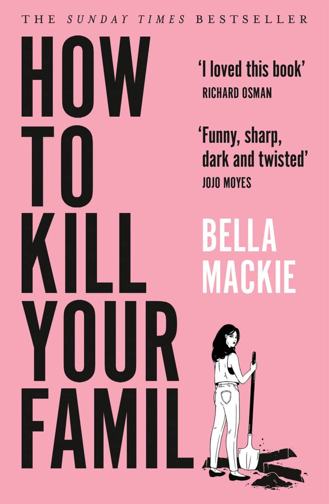
A wonderfully blunt title to a book, and a great cover – I love the way that the Y of Family appears to become a grave… although I have some questions if all that remains of the corpse would fit in that shape… and are the forks of the Y for feet (where are the arms and head) or for the arms (surrendering perhaps?)
Maybe I’m over thinking a light hearted joke!
And somehow the pink cover feels both girly and feminine, but also oddly… meaty.
Susanna Clarke, Jonathan Strange and Mr Norrell
One of my favourite books of all time – although my physical edition is red. The antiquated style of the cover’s font and typography takes us right back to the eighteenth century.

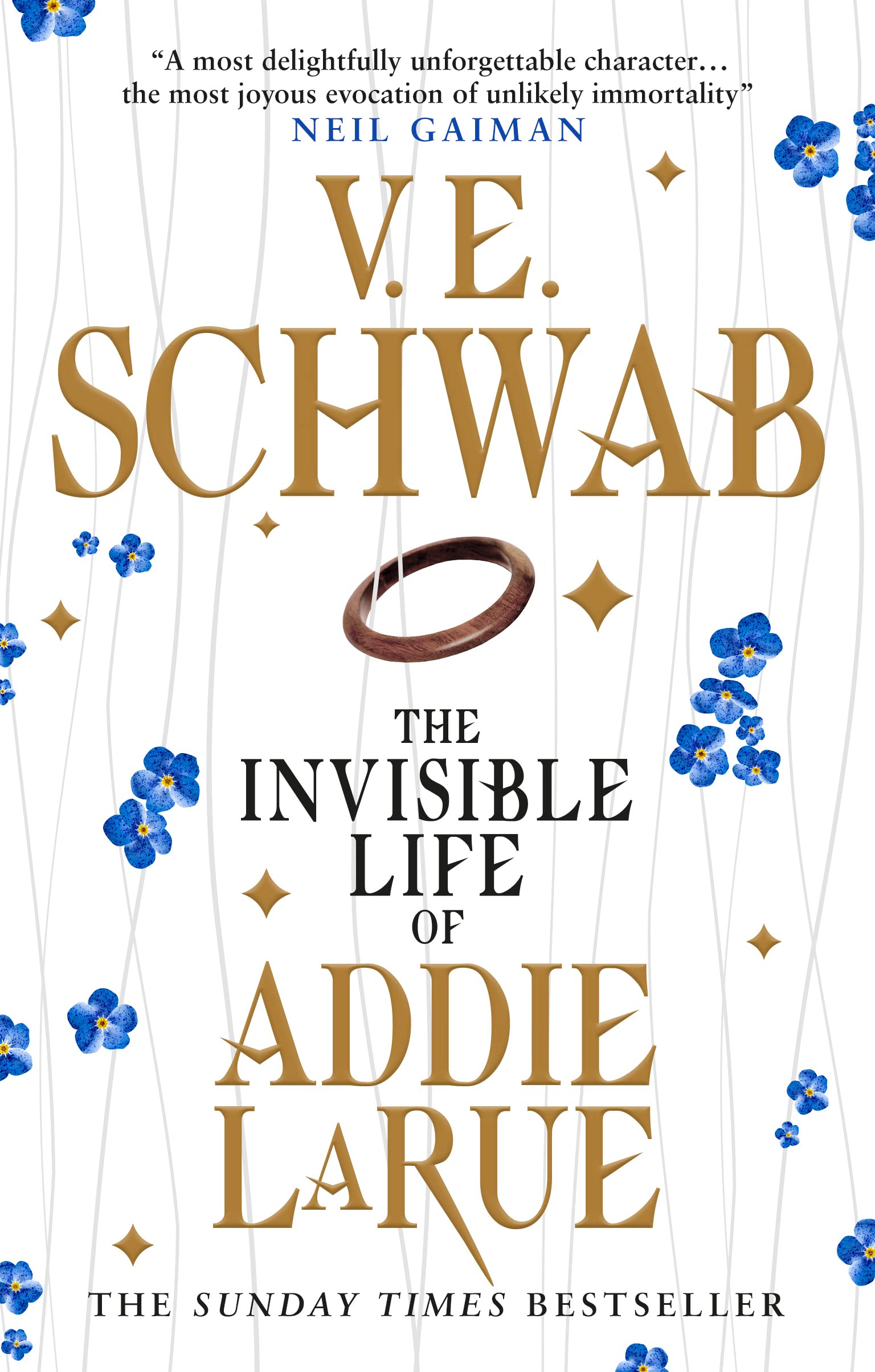
V. E. Schwab, The Invisible Life of Addie LaRue

It only seems fitting, for a novel about a girl who is cursed that, whilst she may be immortal, she will never be remembered does not appear on the cover of her own book.
Or does she, but we don’t remember it?
Holly Jackson, A Good Girl’s Guide to Murder
Who doesn’t love a good murder board? Red string connecting clues, suspects, alibis, motives… the staple of so many iconic TV detective shows.
Holly Jackson plays with the cliché rather knowingly here – and over the series she does subvert the detective genre massively.
But still, a great image for the front cover, building the text into it – and the font that is mimicking a young girl’s curvy cursive handwriting contrasting with the straight lines….

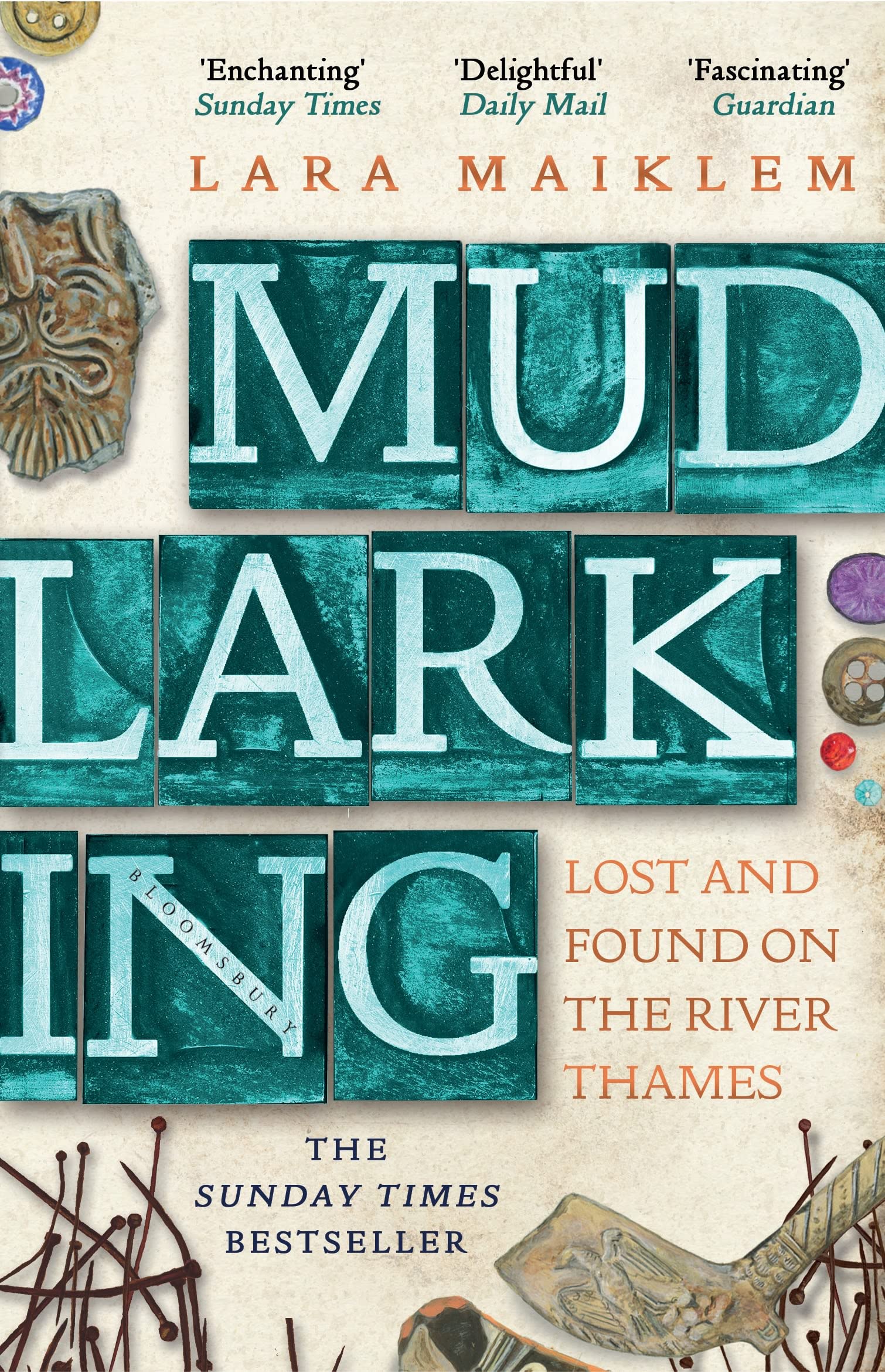
Lara Maiklam, Mudlarking

I love the typesetting printing styling of the letters here.
Lisa McInerney, Glorious Heresies
MiInerney encapsulate the dark humour of Irish writing at its best: irreverent, hilarious, brutal and also humane.
The dripping pain effect – almost perhaps like that of blood dripping down a wall…? – superimposed on the colours of the image of Mary does somehow capture that dark, humourous, Irish tone wonderfully.

Tana French, In The Woods

I think I said last week that I could get one of Tana French’s Dublin Murder Squad into most Top Ten Tuesday lists!
So here we have the gorgeously monochromatic hardcover for In The Woods, the first of that series, with the trees sprouting from the lettering in an almost Blakean manner!
So there we have it, another list… and my last TTT as a sprightly 48-year-old!
As always, I look forward to reading your comments and your posts, and to commenting and replying.
Upcoming Top Ten Tuesday Themes
October 4: Favorite Bookstores OR Bookstores I’d Love to Visit (The UK celebrated National Bookshop Day on October 1, so I thought it would be a fun topic!)
October 11: Books I Read On Vacation (bonus points if you tell us where you were!) (Submitted by Dedra @ A Book Wanderer)
October 18: Favorite Words (This isn’t so much bookish, but I thought it would be fun to share words we love! These could be words that are fun to say, sound funny, mean something great, or make you smile when you read/hear them.)
October 25: Halloween Freebie


You found the best examples of any list I’ve looked at tonight. The Ruth Ozeki book is amazing and In the Woods is so creepy.
Typographical cover examples
LikeLiked by 1 person
Happy birthday (in advance). And great list and picks of titles with typographic covers. The Good Girl’s Guide to Murder also made my list too this week. I hope your reading slump is definitely over and that you have a great birthday this Friday.
Here is my TTT: https://herseriallife.com/top-10-books-with-typographic-covers/
Have a great week 😊
LikeLike
Great selection! In The Woods cover is so utterly gorgeous. I kinda struggled with Jonathan Strange & Mr Norrell when I read it years ago, but I’ve always loved the cover.
Here’s my TTT (fantasy & sci-fi themed):
https://yggdrasille.com/2022/09/27/top-ten-tuesday-typographic-book-covers/
LikeLike
A great list.
I hope you have a good birthday.
I have my book lists on Goodreads which has the American covers.
Have a great week!
Emily @ Budget Tales Book Blog
My post:
LikeLike
Another great list Michael! And Happy Birthday!
Pam @ Read! Bake! Create!
https://readbakecreate.com/ten-book-titles-starting-with-the-letter-a/
LikeLike
Strange & Norrell made my list this week too. I had completely forgotten about Addie Larue, but I love that cover.
LikeLike
I struggled a bit with this topic this week so I did something different. Your list is great!
LikeLike
I love the cover for In the Woods. That is somehow simply and also very creepy.
LikeLike
I thought this week was such a fun topic and your covers are great. I really enjoyed how you spoke to each cover – I didn’t take the time to do that. In the Woods is a great one – I have the Ozeki book too but with a different cover. Great fun. Great list.
Terrie @ Bookshelf Journeys
https://www.bookshelfjourneys.com/post/ttt-cover-typography
LikeLike
So many good ones on here and the In the Woods cover definitely is an eye catcher!
LikeLiked by 1 person
The Tana Fremch seems to be a popular cover design based on the comments today!
LikeLiked by 1 person
So many great choices on this list. I think the cover for Mudlarking is particularly interesting to look at.
LikeLiked by 1 person
I know, it looks gorgeous… but I’ve still to read it!
LikeLike
I also had A Good Girl’s Guide To Murder on my list this week, and mentioned the same thing about the type looking handwritten, so I’m glad it wasn’t just me thinking that!
My TTT: https://jjbookblog.wordpress.com/2022/09/27/top-ten-tuesday-387/
LikeLike
Holly’s is a great add on. Those covers are fabulous and perfect to spotlight as a text design. Thanks so much for visiting my website on this week.
LikeLiked by 1 person
[…] 27th September: Typographic Book Covers […]
LikeLike
[…] 27th September: Typographic Book Covers […]
LikeLike
[…] 27th September: Typographic Book Covers […]
LikeLike
[…] 27th September: Typographic Book Covers […]
LikeLike
[…] 27th September: Typographic Book Covers […]
LikeLike